
How The Right Words Can Make Your App User-Friendly?
Microcopy is what helps users navigate an app smoothly.
However, if a microcopy is poorly written, that may stop your users from performing the desired action.
Which is why we have to choose the right choice of words for an app interface.
Here’s how to improve your UX writing skills:
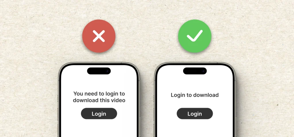
1. Make it simple
The first rule is to keep it plain and simple. You don’t need to impress your users with complex vocabulary or wordy sentences. Doing so may frustrate them.
Instead, use straightforward language that anyone can understand. Your goal should always be to guide users through the interface, not send them running for a dictionary.
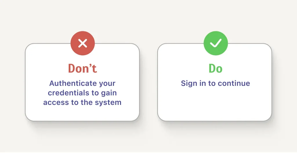
2. Use specific action prompt
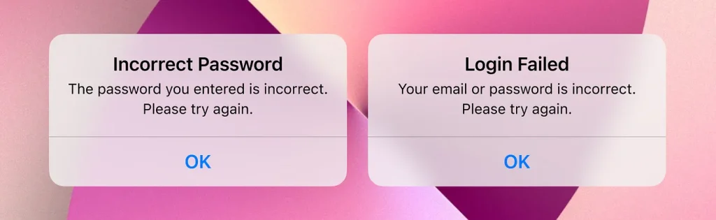
When providing instructions or prompts, make sure they are clear and actionable. Vague messages can lead to confusion and disrupt the user experience.
Instead of telling the users their login attempt has failed, tell them what went wrong. The microcopy should prompt users to take the next step with confidence.
3. Prioritise the right information
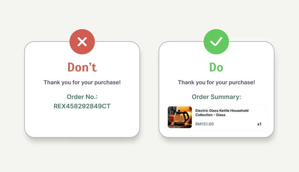
Prioritise what you want to present to your users, instead of bombarding them with information from all directions. Get to the point and provide the most important information first.
For example, users will never want to memorise their order number after purchasing an item. To avoid burdening users, provide the names of their items instead.
4. Be consistent
Use the same tone and terminology throughout your website or app interface. Consistency reduces confusion; users can know what to expect when navigating your website and app.
Whether it’s a button label or an error message, the language and tone should make the app feel like it’s talking to the users with one clear voice.
5. Use numerals
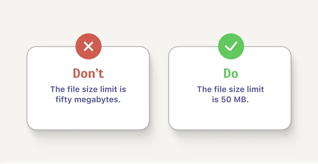
Wherever possible, replace words for numbers with numerals. Not only do numerals take up less screen space, but they are also easier and faster for users to read and remember.
So, decide on a rule (e.g., always spell out single-digit number and use numbers for double digit) and stick with it across the platform.
6. Break up text for better readability
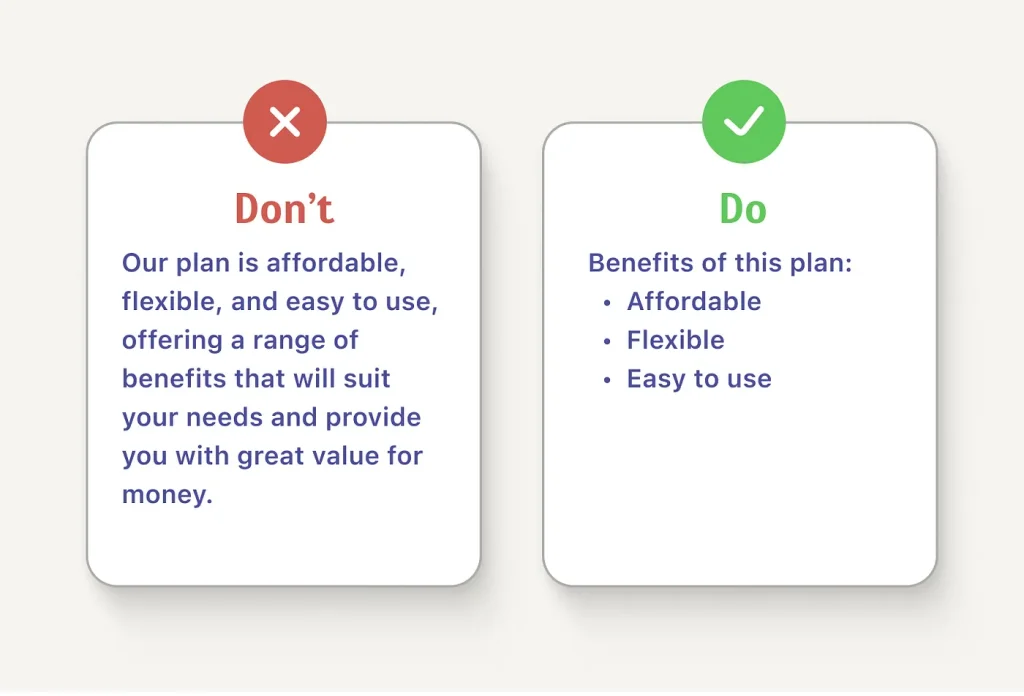
Most people like to scan the text rather than read it. If you write in a long block of text, especially if it’s important information, they are most likely to skip it.
Break your texts into smaller sections, possibly in bullet points. Bullet points are more efficient than paragraphs when it comes to finding and retaining information.
7. Be more creative
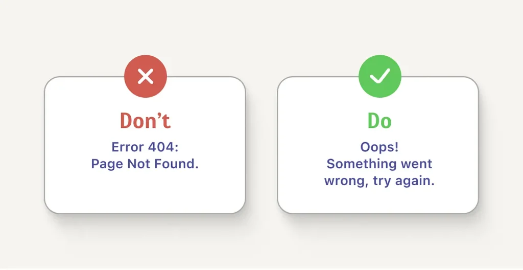
When writing prompts, a little bit of humour goes a long way in diffusing the tension between an error screen and users.
Instead of writing a cold, technical prompt, consider using a playful or witty remark. This can show users that your brand has personality and cares about making their experience enjoyable, even when things go wrong.

On a side note, we have shared our take on whether an app needs to be more minimalistic or simple.
8. Be relevant
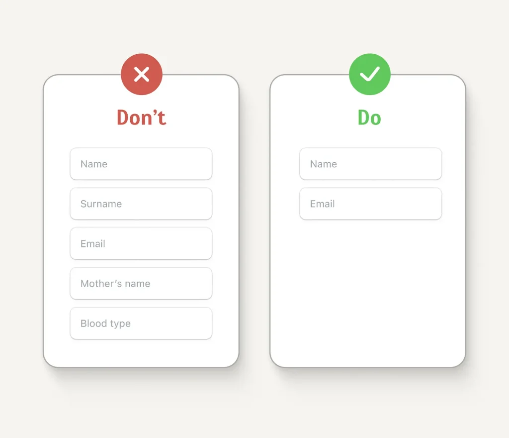
Understand your users’ needs and provide only the information that helps them complete tasks.
Avoid clutter and unnecessary details that might confuse or frustrate them. When requesting user information, keep it simple — ask only for what’s essential.
6. Simplify numerical subjects
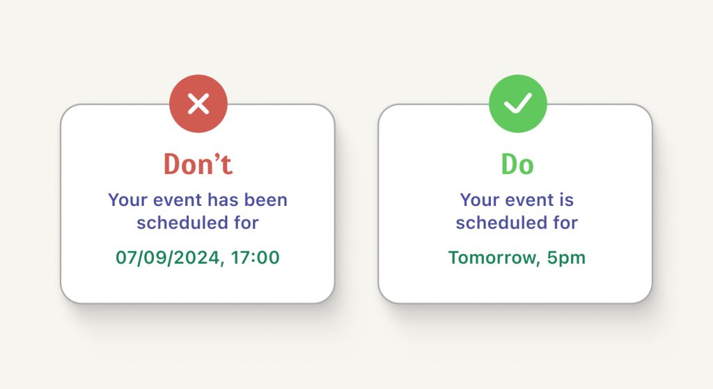
Present information to users. Use “today,” “tomorrow,” or “yesterday” for nearby events. For a distant date, say “Monday, 24 September” instead of “24/09/2024 or 09/24/2024 (for American format).” For times, use a 12-hour clock with “AM” or “PM” for clarity.
10. Write error-free microcopies
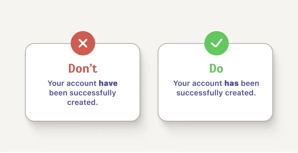
Good UX writing means good writing. Make sure your prompts are free from grammatical errors. Poor grammar is always a turn-off, even if its for an app.
🔔 Bonus
Our UI/UX designers and writers compiled a couple of examples based on the UX writing principles:
| Good call-to-actions | Why it's good? | Bad call-to-actions | Why it's bad? |
|---|---|---|---|
| Submit application | Users know exactly what happens when they click the button. | Go | It's ambiguous and doesn't indicate what to do. |
| Download free guides | Direct users to take specific actions. | Click here | Very generic and lacks context and benefit |
| Start free trial | Invite users to take action (start) and highlights the offer they get (free trial). | Try now | Does not clarify the offer you give. |
| Join our newsletter | Provides clear invitations to users regarding what they are signing up for. | Subscribe | Does not provide information regarding the subscription. |
Conclusion
Microcopies for app interfaces should make the user experience as simple and intuitive as possible for users. There’s really no point in using fancy words or long sentences.
As long as you deliver the instructions for their actions or inform the results of their actions, and users get it, then you have nailed UX writing 🙂
Have A Software Project In Mind?
Let us know your project details and goals, and we will contact you soon for a consultation.